We have come across a lot of iconic cars throughout history. The Volkswagen Golf refined the brand over the past 50+ years as a modern people’s car. The Honda Accord changed the perception of small cars in America by being small, nimble, reliable, and practical. Jeep offerings don’t even need a badge to be understood because of their iconic legacy.
These have shaped the automobile industry more, but there is a tiny detail in all these cars that we are all very familiar with, but don’t know the story behind. We are talking about the brand logos that help, especially a non-enthusiast, understand which brand the car belongs to. But this mundane-looking, tiny badge on cars has a deeper story, history, and legacy, some of which involve cool urban legends, like Jeep. Here are ten popular car logos and their meanings.

Significance Of The Fratzog Logo And What It Means For Mopar Muscle
The mysterious Fratzog logo has been appearing on Dodge cars since the ’60s, and here’s what its comeback symbolizes
Ford
The Blue Oval

One of the oldest carmakers ever, Ford started business in 1903, and hence, this American brand has seen one of the most extensive evolutions of its logo. From what looked like a design worthy of a whiskey brand to the current blue oval design, the Ford logo has seen a total of 11 evolutions, with the latest yet subtle one being done in 2017. The meaning of the “Ford” badge is relatively straightforward, but it requires a lot of attention. It is the initial of the ‘Ford Motor Company’ that was named after its founder, Henry Ford.

The typography of the “Ford” is also based on his handwriting. The font was created by Childe Harold Wills, a Ford Motor Company engineer and designer who was a close associate of Henry Ford. The oval outline, which has been an integral part of the badge, was introduced in 1907 to advertise Ford as the “hallmark for reliability and economy”. The popular blue shade was introduced by Wills in 1927 to represent the qualities of strength, excellence, and trustworthiness.


Chevrolet
The Bowtie

Owing to the age of this brand and no official information on what the Chevy badge means, there have been a lot of theories over the years on its origin and meaning. The most popular story is of its origin being connected to Paris. William C. Durant, on his visit, was mesmerized by a particular wallpaper design in his hotel room. This pattern is what inspired him to conceptualize the bowtie logo. Another popular theory is of Durant’s daughter, who states that an overseas trip did not encourage her father, but rather their own kitchen.

According to her, he stumbled upon the design while doodling away at the dinner table. There’s one more theory that was pitched by Durant’s widow, who claims that he got the inspiration for the Chevy bowtie logo from a newspaper ad for the “Coalettes.” It was a product made by the Southern Compressed Coal Company, and the Coalettes logo was a slanted bow tie that, in fact, looks very similar to that of the Chevrolet bow tie logo. The current iteration, introduced in 2011, uses the now-famous gold shade for the inside of the bow tie.
Toyota
T For Trust
Toyota is renowned as one of the most trustworthy automakers today, with its cars being reliable, affordable, and practical. This is also the basis of what defines this Japanese brand’s logo. The two smaller, elongated circles within the larger outer circle resemble a Venn diagram depicting the hearts of the customer and the company, further reinforcing “trust” between the brand and the buyer.
The brand is named after its founder, Kiichiro Toyoda. However, “Toyoda” was only used on its logo in 1935. Since 1958, it has been “Toyota.” A simple spelling difference brought about the change during a design competition held to celebrate the completion of its first passenger car. The public even saw a design featuring the Japanese characters for “Toyota” surrounded by a circle, winning among 27,000 odd entries.
The only difference between the Japanese words “Toyoda” and “Toyota” is two tiny dashes in the last alphabet. This error was taken as a creative tweak. Toyota then made a lot more sense for a few reasons. Firstly, while visually similar, “Toyota” sounded less cluttered and more pleasing thanks to a voiceless consonant sound in Japanese. Then the number of strokes to write “Toyota” in Japanese was eight, which is believed to be connected to wealth and good fortune. Then the big guns thought that it would be wise to stray away from calling their automobile brand “Toyota”, which literally means “fertile rice paddies”,

Cars And Manufacturers That Have A Horse Logo
A symbol of strength, agility, and loyalty, the horse has been used to embody the spirit of numerous manufacturers. How many can you name?
Honda
Proudly Showcasing The Founder’s Initial

The logo of one of the world’s most popular automakers has a straightforward meaning. The “H” in Honda’s logo refers to the name of the company and its founder, Soichiro Honda. The logo features an “H” with a broader top and a narrower bottom, giving the impression of a person with their arms raised to the sky. This design choice most likely reflects Honda’s official slogan, “The Power of Dreams.”

A trivia many are unaware of is that Mr. Honda was disappointed when the brand named itself after him, as he believed the brand was for the betterment of society as a whole, not an individual, which he firmly believed was the case when a brand names itself after an individual. But despite going against his values, “Honda” still reflects his philosophy of never giving up on people. The name is composed of two elements: “hon,” meaning “base, foundation, or origin,” and “da,” meaning “rice field.” While this is the literal meaning of the Japanese words, the surname does reflect the importance of agriculture in Japanese society and highlights the value of hard work and perseverance.
Nissan
Penetrating The Sun

Not many are aware, but the original Nissan logo was actually a modified version of the Datsun logo. The latter was based on the flag of Japan and Japan’s nickname as the “Land of the Rising Sun”, hence the circular orange-red element in the backdrop. When Datsun was discontinued in 1984, and Nissan Motors became an official automobile brand, it adopted the same logo and replaced “Datsun” with “Nissan.” Now, the word “Nissan” is an abbreviation of Nihon Sangyo, which means “Japan Industry”.

This name was used as the company’s stock ticker symbol, abbreviated as “Ni-san,” and was officially adopted in the 1930s. The logos that came after that (although a lot minimal) were evolutions of the original. Apart from this, the word “Nissan” is also a combination of Japanese characters “Ni” and “Ssan”, meaning “Sun” and “product” or “birth. The latest iteration of this logo, introduced in 2020, adds greater sophistication and sharpness, reflecting its futuristic approach. The logo also reciprocates well with its founder Yoshisuke Aikawa’s ideology of “Shisei tenjitsu o tsuranuku,” meaning “If you have a strong belief, it penetrates even the sun.”
GMC
One Of The Most Recognizable Logos In North America

This is one of the most straightforward logos in this lot. There is no deep meaning behind the “GMC” that you see on the numerous trucks on the roads. It is the short form of General Motors Company (formerly General Motors Truck Company, which General Motors acquired), a division of General Motors.

The logo is simple, with the initials of the brand name plastered on the grille. The “GMC” badge is vast, bright red, and decorated with silver borders. It is out there, symbolizing raw power and brutal utility, something that resonates well with GMC owners. The oldest “GMC” logo was a lot fancier, though, and was devoid of the red shade it is known for. The current iteration of the logo was introduced in 2014.
Jeep
It All Started With A Nickname

The name Jeep is synonymous with off-roading SUVs today. This brand produces some of the most influential off-road-ready SUVs, like the Wrangler and the Grand Cherokee. Over the years, the logo has changed drastically, but the word “Jeep” has remained a constant. There are a lot of theories on how Jeep got its name. The most popular is the one featuring the character “JEEP” from the Popeye comic strip.

This character is a small, magical creature that can go anywhere and solve any problem. It is said that during WWII, the US government wanted a versatile all-wheel-drive military vehicle. This was initially designated “GP,” where “G” signifies a government contract vehicle and “P” indicates it was a 1/4-ton “light reconnaissance vehicle” for various military tasks. When the army vehicle was introduced, American soldiers began referring to it as “Jeep” for its versatility and ability to navigate challenging terrain.

Range Rover Debuts First Logo In 55-Year History
In case you didn’t know, Range Rover is its own brand of vehicles now, along with Defender, Discovery, and Jaguar.
There is also an urban legend that states that “Jeep” is an acronym for “Just Enough Essential Parts” because it is rugged and reliable in taking on any challenges thrown its way. Among all the theories, the one connecting “JEEP” from the Popeye comic strip to its influence on soldiers during World War II remains the strongest and is widely recognized as the origin of the name “Jeep”. The latest iteration of the logo, updated in 1993, features “Jeep” in khaki green, which most likely is an ode to its military legacy.
Tesla
More Than Just A Stylish “T”

Tesla is known for its early mass adoption of electric powertrains for passenger cars and minimal design language. This brand continues to enjoy a stronghold in the ever-evolving electric space. The Tesla logo on the vehicles is quite cool and futuristic, but its meaning was misunderstood.
While it’s quite natural to think out of the box or even quite simply as a depiction of a stylish “T” due to Tesla’s association with minimalism, the actual meaning of the Tesla logo is quite technical. In 2017, Elon Musk finally cleared up the meaning of the Tesla logo. It is, in fact, a cross-section of an electric motor, which clearly emphasizes the brand’s core focus on electric power.
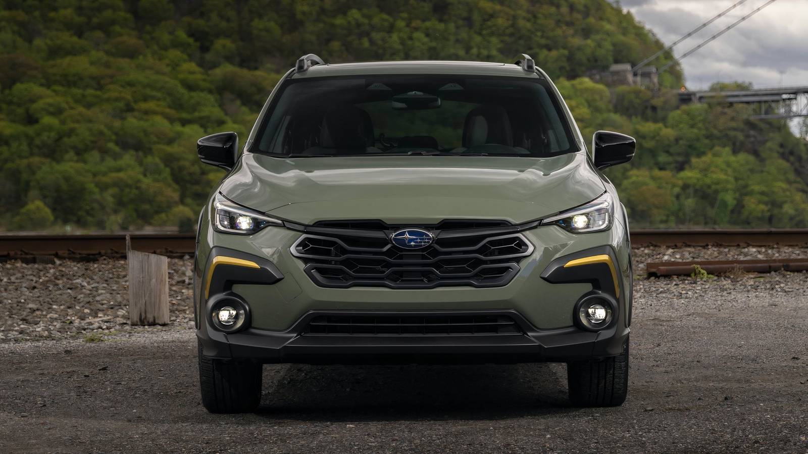
Subaru
Heritage And Unity

This is one of the most detail-intensive car brand logos out there. Subaru is a heritage-rich automaker that has been around since 1953. Its logo has undergone nine evolutions over its lifespan, with the latest update in 2019. While the Subaru logo has undergone a drastic visual change, its underlying meaning and significance have been upheld since the 1950s. The word “Subaru” can be roughly translated to “unite” or “together” in Japanese.

Subaru Corporation chose this name to represent the ideology of unity and to honor the Pleiades star cluster, which has great significance in Japanese culture. The Pleiades is a prominent star cluster in the constellation Taurus and is called “Subaru” in Japanese. The six stars in the logo represent the brightest and largest ones in the Pleiades cluster. It also symbolizes the six companies that merged to form Fuji Heavy Industries, the parent company of Subaru. The layout of the stars conveys the concepts of unity and harmony, and the enclosed oval shape of the logo symbolizes Earth and Subaru’s global reach.
Volkswagen
‘Car For The People’

Volkswagen’s idea of being a mass market brand is well represented by its logo. While it did start with a controversial cogwheel circle around the logo back in the 1930s, the core design included a “V” and a “W” stacked every so cleverly to look like a giant “W”. While there was a notable gap between the “V” and “W” in the logo, it also sparked controversy over its origin. Volkswagen states that the logo was designed by an engineer called Franz Reimspiess, who also worked on the engine for the original Beetle.

However, an Austrian designer named Nikolai Borg claimed to have designed the logo in 1939. His version of the logo didn’t have a gap between “V” and “W,” which sparked the buzz that Volkswagen sneakily added it to avoid paying Borg. But this controversy was finally squashed in 2005, when a Vienna Business Court rejected Borg’s copyright claim, ruling that the VW logo had already been trademarked a year before his design. The two letters represent the German words “Volks” and “Wagen”, which literally translates to ‘people’s car’ or ‘car for the people’. The latest update to the Volkswagen logo was in 2019 to depict its new era of mobility.